WSJ Website
WSJ.com is an indispensable connection to users. Leading the UX design team, I oversaw a holistic re-platforming of the homepage and section fronts, integrating brand, editorial, and experience design into a cohesive, user-first system. Our approach was grounded in the belief that news experiences resonate most when clarity, consistency, and adaptability are prioritized. At the core of this strategy was a robust design system, aligning user needs with broader company goals.
Title
• Director, Experience Design, WSJ
Roles
• Design Strategy • Design Leadership
Results
• The homepage was reimagined as a clear, navigable entry point focusing on editorial hierarchy in service of user clarity.
• Section fronts were designed to reflect their unique editorial voices while maintaining consistency.
• Introduced a flexible, user-facing set of horizontal features.
Another Brick in the Wall
Design Strategy
Found State
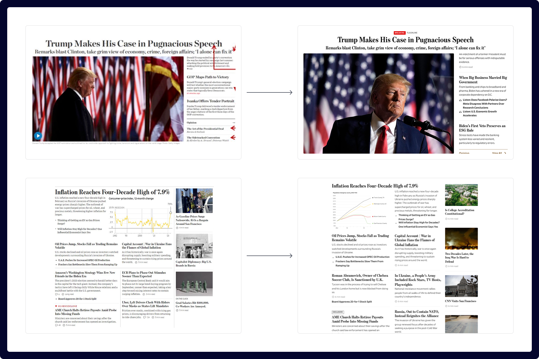
The homepage suffered from visual overload, clashing attention zones, and unclear hierarchy, making it difficult for users to focus or navigate.
Competing content, aggressive ads, and dense financial data crowd the space, while subtle navigation cues and poor typographic contrast weaken clarity.
With smarter grouping, visual restraint, and a clearer priority structure, the experience could be significantly improved.

Voices
Each component was considered from the perspective of the information it held. We called that perspective “voice” and it informed how specific elements would ultimately be designed. Considering how tone and language varied between voices allowed us to clarify purpose and express the design of each element precisely and appropriately.

Smarter Grouping and Spacing
Negative space works like mortar between bricks by separating modules while holding the structure together. Thoughtful spacing clarified relationships, guiding the eye and enhancing scannability.
Pulling out, these small changes reveal their outsized impact: cognitive load is reduced, and editorial priorities become easier for readers to navigate and understand.
Editorial Identity
A modular component strategy enabled scalable layouts across homepage and section fronts—ranging from automated feeds to curated, high-touch editorial presentations.

Systematic Consistency
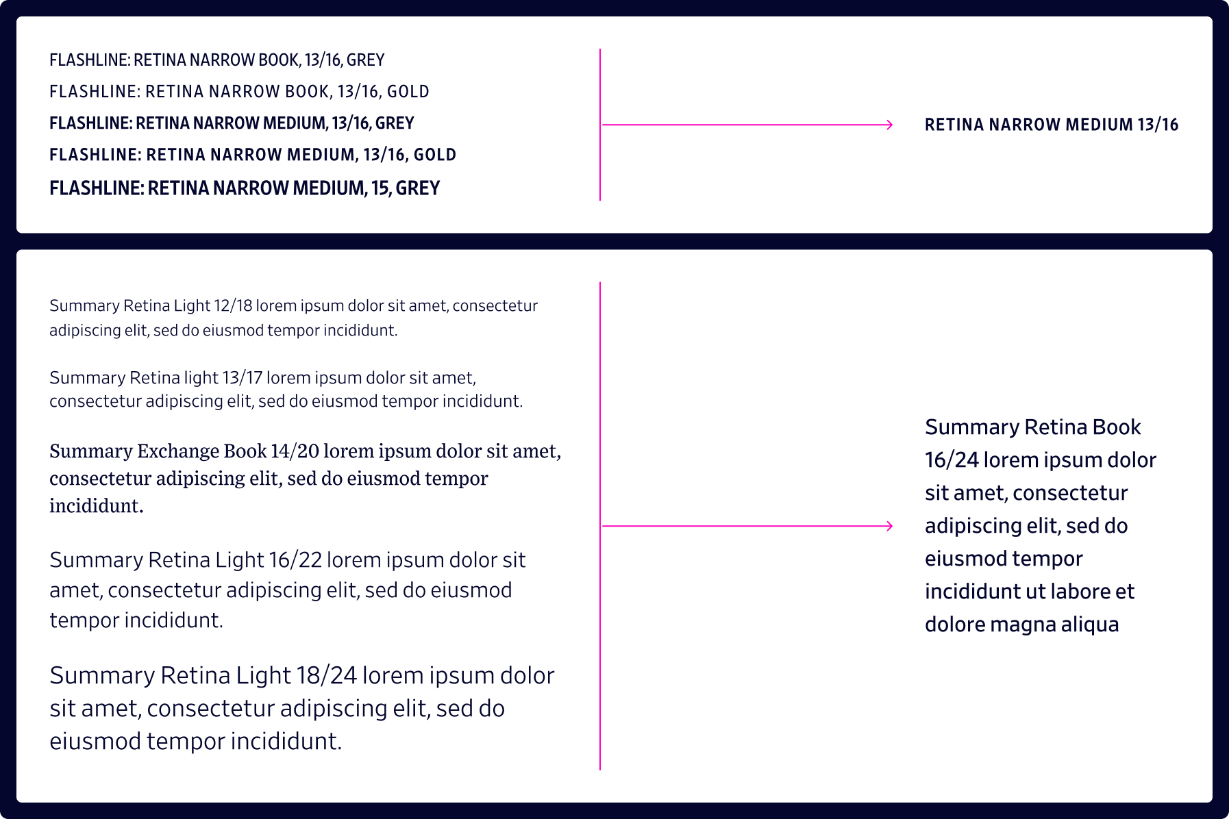
Inconsistencies in typography and how information was organized degraded SEO, brand, and user experience. We sought to simplify the design language using core WSJ typefaces and patterns that were familiar to our users to better express brand and editorial intent.
Discoverability
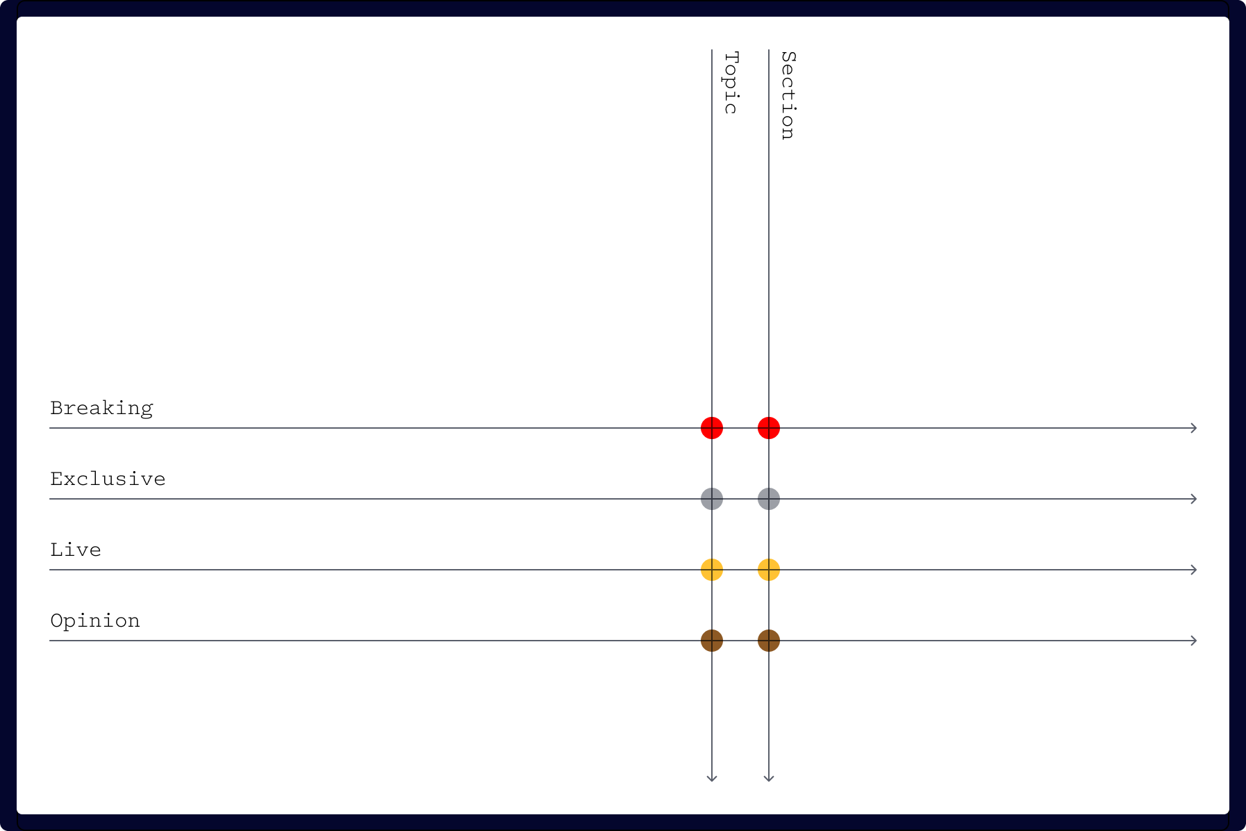
I introduced Content Tags, horizontal labels that transcend vertical taxonomy. They enable dynamic surfacing, providing a scalable way to highlight content without burdening the hierarchy.
The Space Between
Design Implementation
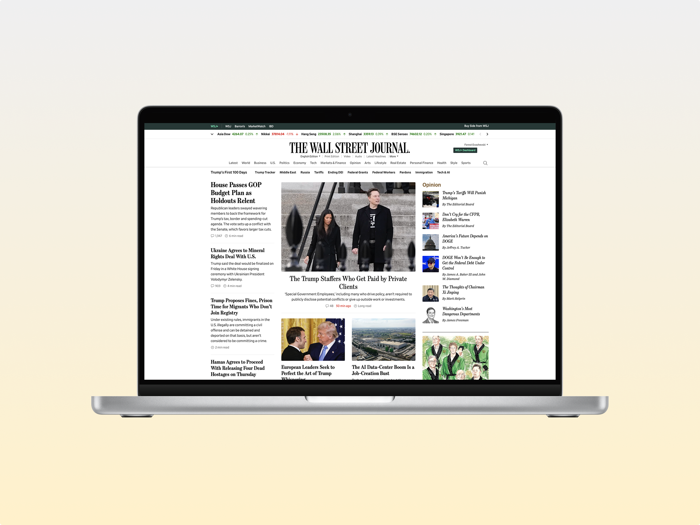
Homepage
Responsive web, 16u (desktop) with ads removed.

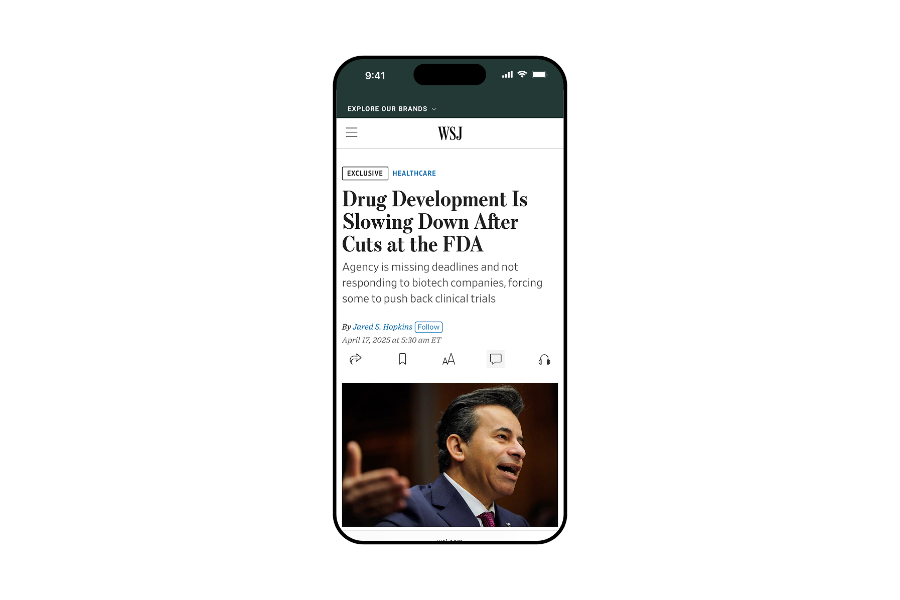
Responsive web, 4u (mobile)

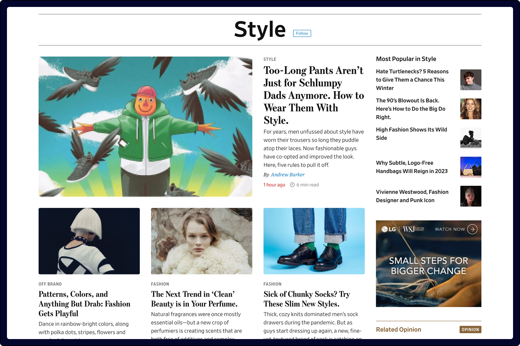
Section Fronts
Responsive web, 16u (desktop)
Responsive web, 4u (mobile)

Content Tags
Shown in situ

Content tag shown in 4u (mobile) article