
Real Estate
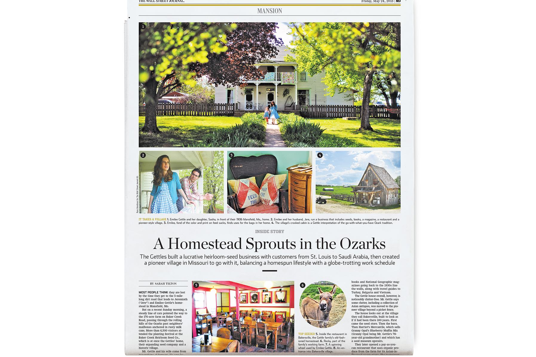
Mansion is The Wall Street Journal’s platform for residential real estate and I shaped its visual identity from the beginning—developing the initial prototypes, visual guidelines, and directing all visual content. We launched Mansion with the idea that real estate is most compelling when it’s about the human beings who live in it. Behind the grand spaces, there were quiet moments, personal histories, and details that made a house feel inhabited—not just owned. A sweeping estate is impressive, but a hand on a worn banister or an overstuffed bookshelf tells a richer story.
Title
• Art Director
Roles
• Visual Strategy • Design Leadership
Creative Direction
• Photography highlighted honest voices, a spirit of gratitude, and a sense of nostalgia.
• Illustrations grounded financial topics while maps double as expressions of wanderlust and discovery.
• Layouts revealed both the people and the objects they cherish in addition to their homes.

Photography by Jeremy Wilson.
Life of the Party
Commissioning of Illustration
Playful illustrations softened the edges of rigid, cold buildings and everyday scenes for a sense of charm.
Illustration by Satoshi Hashimoto.

JJ
“Jumbo Jungle” offered insights into the financing of high-value properties. The dense subject matter was difficult to visualize so we developed a recurring character named JJ who would return every week with a new visual presentation.
Early sketches by Chris Gash shown here.

JJ evolved into a quirky and lovable character. He was an important fixture for years.
Illustrations by Chris Gash

Maps
The visual strategy called for two types of maps. We used modern and detailed cartography for large features while we developed a more traditional spot map style in circle frames.
Maps by Hey Studios; WSJ Graphics (inset)


There’s No Place Like Home
Photography & Styling Direction
The stories are marked by honesty, with subjects speaking candidly about loss, resilience, aging, and ambition—often unpolished and revealing deep vulnerabilities.
There is a spirit of thankfulness throughout, as we prioritized presence over performance, and subjects expressed quiet gratitude for their homes, rituals, and treasured objects.
Nostalgia threads through the photography, which echoed the style of a travel section, presenting each home as a souvenir of a journey—rich with wonder, wanderlust, and a touch of envy.

The Photography was Honest.
“House Call” by Marc Myers is a column that delves into the personal histories of notable individuals, focusing on their childhood experiences and the homes they grew up in.
These were poignant accounts of struggle and formation. The photography had to reflect that candor.
Photography by J.R. Mankoff; Elizabeth Lippman; Annie Tritt (Left to Right)

The Photography Portrayed a Sense of Thankfulness
Throughout Mansion the art direction aimed to balance affluence with humility, placing images like this one on the cover.
These images conveyed warmth, character and personal pride.
Photography by Bob Stefko.

The Photography Conveyed Nostalgia
Mansion’s visual approach treated real estate as emotional landscape. Images like these invited readers to project themselves into a place where home could be more than a structure—it might be a state of mind.
Rhythm & Views
Layout & Design
Layout conveyed three things:
Impact. Range in frame size, crop, subject matter, and integrated illustration packed visual power.
Delight. Circles and integrated illustrations disrupted rigid layouts, adding visual warmth and playfulness. These “happy shapes” subtly introduced rhythm and a human touch to structured grids.
Balance. Each layout balanced the strengths of illustration and photography for a holistic storytelling experience and voice.

Impact
Mansion was a digital pioneer at WSJ. We led the adoption of new web layouts like “Big Top” and formed new cross-platformed workflows in the newsroom.


Delight
Layouts balanced intimate details, sweeping views, and quiet human moments.
